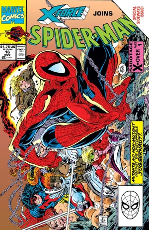
Random Comic Books ... Spider-Man #16

Spider-Man #16
Spider-Man #16

RANDOM THOUGHTS ... Spider-Man #16 was published in November 1991 and was the final issue for this title written and illustrated by Todd McFarlane. Months later McFarlane headlined a collection of artists that founded Image Comics, where he launched his own title, Spawn. Spawn went on to become the most successful Image Comics title, and McFarlane revolutionized comic book merchandising along the way.

• This is a special sideways issue; All pages are written and drawn in a landscape layout. In this book, it works, and as you might expect, McFarlane fills the frames with awesome images.  

• The fact that #16 is McFarlane's last on the title is acknowledged in several places throughout the issue: 

On the cover, Spidey says "Bye, Todd". 

On the last panel of the issue, a fantastic 2-page mural featuring Spidey and X-Force, there is a message thanking the fans for reading, signed by Todd McFarlane.

In "Crawl Space", the reader feedback page at the end, McFarlane devotes the entire page to explaining his exit and giving thanks. 

• Before writing/illustrating the Spider-Man series (which began it's run in 1990), McFarlane had inked Amazing Spider-Man issues #298-323, 325, and 328. He gained notoriety after conceptualizing and drawing the first full appearance of Venom, in Amazing Spider-Man #300. 

• McFarlane was succeeded on Spider-Man by artist Erik Larsen, the same fellow who had previously succeeded McFarlane on Amazing Spider-Man. Larsen inked a 6-issue story arc for Spider-Man (issues #18-23), then joined McFarlane as one of the original Image founders in 1992, where he launched Savage Dragon.

• Todd McFarlane is not only an amazing artist, creator, and businessman, but he's also a former college baseball player who collects historic baseballs (i.e. Mark McGwire's record-breaking 70th- home run ball from 1998). I like comic books and baseball. Todd McFarlane is probably the coolest human being on the planet. 

Comments

Popular posts from this blog

Top 10 Baseball Card Designs of the 1980's

The 1980s represented a high point for the baseball card industry, both in terms of mainstream popularity and in terms of card design. Many of the most popular and recognizable card designs of all-time were produced during this decade. Below are my Top 10 baseball card designs of the '80s, based on overall attractiveness, creativity and/or innovation, and my own personal preferences. Card backs are not weighed as much in these rankings, but I like to read the backs of baseball cards, so bonus points are given to good design there as well.  So without further ado... 10. 1989 Donruss  The '89 Donruss set is easily distinguishable for the multi-colored borders at the top and bottom of the cards. This gradient effect (which Donruss debuted in 1988) would be emulated many times by many companies in the decades that followed. I also like the way Donruss utilized the space on the back of the cards. A maximum of five seasons worth of stats are displayed along w...

Nate Hates Hot Coffee

I’m sure I’ll catch all kinds of guff and/or flak for saying this, but here goes: I hate hot coffee. But you know what I love ? Warm coffee. Same thing with hot chocolate. Hot chocolate: Bad. Warm chocolate: Best thing ever. Hot coffee is too damn hot. It’s like sticking a branding iron in your mouth. You need a NASA-designed thermos with inch-thick styrofoam walls just to hold it, yet I’m supposed to drink this stuff? What the heck is the point of pouring a cup of coffee if I can’t drink it for two hours? Can’t they figure out a way to serve it at room temperature so I can drink it right away? And how is it that every time I take a sip to see if it’s cooled off enough, it’s still too hot? Doesn’t matter how long I wait. Ten minutes. Twenty minutes. Ninety minutes. It’s always still too hot. Every. Single. Time. People are always trying to sell me on hot coffee: “ Hot coffee smells soooo good! ” Yeah, well so does a lilac bouquet, but I don’t want to drink it. “ Hot coff...

Nate's Notebook: How I would try to make baseball safer

Although it's a given that baseball players are going to get hurt, there are some ways that Major League Baseball could make the game less hazardous for it's athletes. Here are a few practical ideas to help make the game safer without changing the way it's played. 1. Foam rubber outfield walls. Why are the outfield walls in major league baseball parks covered with padding the thickness of an oven mitt? In some spots there is no padding at all. Wrigley Field literally has a brick wall out there. Players get hurt crashing into these walls all the time. Earlier this season, Yankees OF Jacoby Ellsbury received a sprained neck and a concussion slamming into a wall. He made the catch, but landed on the DL. Clearly, the "warning track" is not enough of a deterrent. Outfield walls are bad for your health. Photo: USA Today My suggestion: 3-foot-thick foam rubber outfield walls. This would prevent countless serious injuries every year, and it wouldn'...