The 1980s represented a high point for the baseball card industry, both in terms of mainstream popularity and in terms of card design. Many of the most popular and recognizable card designs of all-time were produced during this decade.
Below are my Top 10 baseball card designs of the '80s, based on overall attractiveness, creativity and/or innovation, and my own personal preferences. Card backs are not weighed as much in these rankings, but I like to read the backs of baseball cards, so bonus points are given to good design there as well.
So without further ado...


With it's bright colors and softened edges, the '89 Topps design is easy on the eyes. The stylized team nickname and player name graphic is fun and distinctive, and team-colored inner borders frame some of the best baseball card photography of the decade.


The classic wood-grain borders and simple elegance of '87 Topps make it the best design of the 1980's, and in my opinion, the most iconic baseball card design of all-time.
Below are my Top 10 baseball card designs of the '80s, based on overall attractiveness, creativity and/or innovation, and my own personal preferences. Card backs are not weighed as much in these rankings, but I like to read the backs of baseball cards, so bonus points are given to good design there as well.
So without further ado...
10. 1989 Donruss

The '89 Donruss set is easily distinguishable for the multi-colored borders at the top and bottom of the cards. This gradient effect (which Donruss debuted in 1988) would be emulated many times by many companies in the decades that followed.

I also like the way Donruss utilized the space on the back of the cards. A maximum of five seasons worth of stats are displayed along with the career numbers, which allows room for a more descriptive Career Highlights section.

I also like the way Donruss utilized the space on the back of the cards. A maximum of five seasons worth of stats are displayed along with the career numbers, which allows room for a more descriptive Career Highlights section.
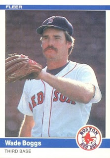
9. 1984 Fleer

The 1984 Fleer set is clean and simple, with maximum real estate afforded to the large player photo. Solid blue bands and vibrant team logos add color to the cards, which set a new standard for the less-is-more approach to effective design.

8. 1985 Donruss

Donruss experimented much more with border graphics and colors than the other companies did during the 1980s. The '85 Donruss set, which features orange stripes on a dark background, stood in stark contrast to the abundant white-bordered-sets of the era, and helped redefine how companies thought about the space at the edge of the cards.

7. 1985 Topps

The '85 Topps design is bold and beautiful. The player photo is big, the team logo is big, and the team name is written in big block letters inside a big bright box. It all works for me. It's a simple, fun design that looks great in a D-ring binder full of 9-card pages.
6. 1989 Topps

With it's bright colors and softened edges, the '89 Topps design is easy on the eyes. The stylized team nickname and player name graphic is fun and distinctive, and team-colored inner borders frame some of the best baseball card photography of the decade.
5. 1988 Score

Score (a Pinnacle brand) burst on to the scene in 1988 and immediately challenged all the rules of historical baseball card design.
Every card in the set featured a brightly-colored border, something that hadn't been done before. And not every card had the same colored border; There were 6 different border colors (orange, red, blue, purple, green, yellow) in the 660-card set.
Up until that point, with rare exceptions (namely, '62 and '71 Topps), baseball card borders had been plain white. Following the release of '88 Score, brightly-colored borders became commonplace.

Furthermore, the back of the card was no longer just a data spreadsheet; Along with statistics, the back of Score baseball cards featured a color photo on the back and flowing, detailed descriptions and scouting reports of the players that painted a much more vivid picture than numbers alone.
Score (a Pinnacle brand) burst on to the scene in 1988 and immediately challenged all the rules of historical baseball card design.
Every card in the set featured a brightly-colored border, something that hadn't been done before. And not every card had the same colored border; There were 6 different border colors (orange, red, blue, purple, green, yellow) in the 660-card set.

Furthermore, the back of the card was no longer just a data spreadsheet; Along with statistics, the back of Score baseball cards featured a color photo on the back and flowing, detailed descriptions and scouting reports of the players that painted a much more vivid picture than numbers alone.
4. 1983 Topps

The '83 and '84 Topps sets are similar in design, and so they often are compared to one another. Both feature two player photos on the front, one large and one inset. Both are colorful and distinctive.
A lot of collectors prefer the '83 Topps' rounded-borders to the '84 Topps' square-corners feel; It's all a matter of personal preference.
Either way, it's a great-looking card and a game-changer in terms of design.
A lot of collectors prefer the '83 Topps' rounded-borders to the '84 Topps' square-corners feel; It's all a matter of personal preference.
Either way, it's a great-looking card and a game-changer in terms of design.
3. 1984 Topps

Like the '83 set, '84 Topps included two player photos on the front of the card, but also added an original new feature with the team name printed vertically down the side of the cards. The combination of all these things made the '84 Topps design a winner and it endures as one of the most memorable of all-time.
Like the '83 set, '84 Topps included two player photos on the front of the card, but also added an original new feature with the team name printed vertically down the side of the cards. The combination of all these things made the '84 Topps design a winner and it endures as one of the most memorable of all-time.
2. 1989 Upper Deck

While Score's 1988 debut changed the rules in terms of card design, I think it's fair to say Upper Deck's debut in 1989 set a new standard in terms of premium card design and ushered in a new wave of card-collecting.
The 1989 Upper Deck set featured huge, beautifully-shot player photos on the front, with minimal real estate given to player and team name.
The right border depicts the first-base line, which is not only an apt and nice-looking graphic, but also a cool and clever runner for their brand (the 1990 Upper Deck set moved the graphic to the top and depicts the 1st-base-to-2nd-base path, for example).

Card backs contained another huge player photo taking up over 50% of the available space. Recent and career stats are given, and career highlights are included where space permits. A small hologram (an industry first) was also included on the back of every card to ensure authenticity.
While Score's 1988 debut changed the rules in terms of card design, I think it's fair to say Upper Deck's debut in 1989 set a new standard in terms of premium card design and ushered in a new wave of card-collecting.
The 1989 Upper Deck set featured huge, beautifully-shot player photos on the front, with minimal real estate given to player and team name.
The right border depicts the first-base line, which is not only an apt and nice-looking graphic, but also a cool and clever runner for their brand (the 1990 Upper Deck set moved the graphic to the top and depicts the 1st-base-to-2nd-base path, for example).

Card backs contained another huge player photo taking up over 50% of the available space. Recent and career stats are given, and career highlights are included where space permits. A small hologram (an industry first) was also included on the back of every card to ensure authenticity.
1. 1987 Topps

The '87 Topps set removed the player position from the front of the card, allowing more room for the rounded team logo at the top, and team-color-themed box containing the player name at the bottom.
But it all comes back to the distinctive wood-grain borders, which provided the perfect picture frame for Topps' great photography, and their ability to elevate a common baseball card into a masterpiece.
The fresh look was a first-ballot Hall-of-Famer and remains one of the most recognizable card sets ever produced.

Thanks for taking the time to discuss this, I feel strongly about it and love learning more on this topic. bestsportsgearhub.com
ReplyDeleteYes i am totally agreed with this article and i just want say that this article is very nice and very informative article.I will make sure to be reading your blog more. You made a good point but I can't help but wonder, what about the other side? !!!!!!THANKS!!!!!! best maple bats
ReplyDelete